
How to honor industry trends while creating patterns built to last generations
The fashion industry runs on cycles—seasonal collections, trending colors, must-have palettes that shift with the cultural zeitgeist. WGSN’s AW 26/27 color forecast has already begun shaping collections, highlighting “Transformative Teal” as their color of the year alongside “Fresh Purple,” “Green Glow,” “Wax Paper,” and “Cocoa Powder”—colors that speak to our cultural need for both renewal and grounding.
But what happens when you’re designing patterns meant to last not just one season, but generations?
This tension between trend awareness and timeless design is exactly what drove the creation of my Prismatic collection. Rather than chase fleeting color moments, I asked a different question: How can we capture the emotional essence of forecasted colors while creating something that transcends the trend cycle entirely?
The Challenge of Color Forecasting in Sustainable Design
Traditional fashion operates on planned obsolescence—colors are chosen to feel fresh for a moment, then dated enough to drive replacement purchases. It’s a system that works beautifully for fast fashion but feels fundamentally at odds with creating garments meant to be treasured.
WGSN’s AW 26/27 palette speaks to transformation and authenticity: “Transformative Teal” suggests evolution and depth, “Fresh Purple” brings unexpected vibrancy, while “Green Glow” pulses with renewal energy. These aren’t just aesthetic choices—they’re psychological responses to our current world. But emotions and needs don’t become obsolete the way trend colors do.
The Prismatic collection captures these emotional currents while translating them into something more enduring.
Beyond the Trend: The Philosophy of Prismatic
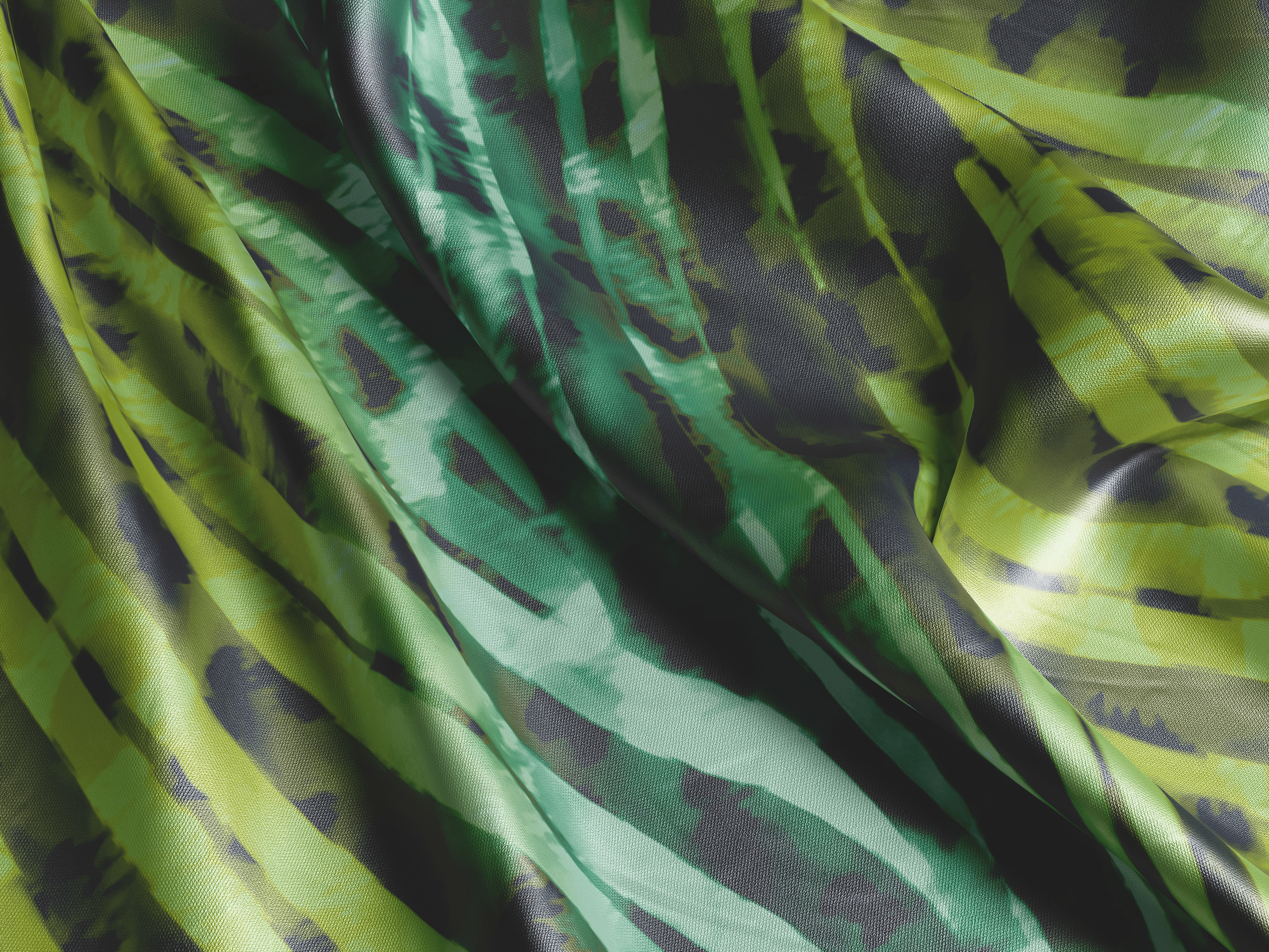
Instead of lifting specific forecast colors wholesale, Prismatic explores the relationships between colors—how chartreuse and deep purple create tension and harmony simultaneously, how teal can feel both technological and oceanic, how certain combinations make us pause and look closer.
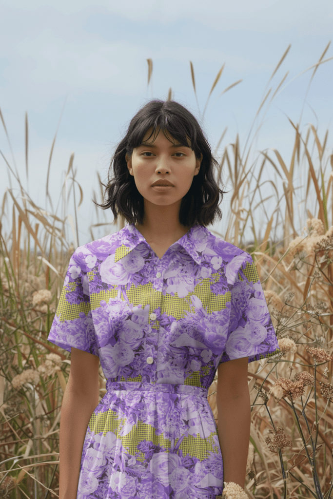
Take my signature purple and chartreuse floral overlay. The vibrant lime green echoes WGSN’s “Green Glow”—that sense of renewal and forward momentum. The deep purple resonates with their “Fresh Purple,” bringing unexpected sophistication. But more importantly, this combination creates what I call “pleasant cognitive dissonance”—familiar enough to love, unexpected enough to treasure.
These aren’t colors that will look dated in five years because they tap into something more fundamental than trend cycles. They explore the timeless human fascination with contrast, with the unexpected, with finding beauty in surprising places.
Making Trends Timeless: The Prismatic Approach
Each piece in the Prismatic collection follows three principles:
1. Emotional Resonance Over Literal Translation Rather than using forecasted colors exactly as prescribed, I extract their emotional intent. When WGSN identifies “Transformative Teal” as their color of the year, I explore what transformation means visually—depth, evolution, the space between what was and what could be.
2. Complex Color Relationships Trend colors are often presented in isolation, but real-world color experiences are always relational. Prismatic patterns layer colors in ways that create depth and discovery—how “Cocoa Powder” grounds vibrant teals, how “Wax Paper” neutrals allow purples to sing.
3. Pattern as Color Context The geometric overlays in Prismatic aren’t decoration—they’re color delivery systems. A houndstooth pattern in chartreuse reads completely differently than a floral in the same hue. The pattern becomes part of the color story, creating complexity that rewards sustained attention.

The Sustainability of Timeless Color
Here’s what the fashion industry rarely acknowledges: truly sustainable design isn’t just about organic fibers and ethical labor (though those matter enormously). It’s about creating things that people don’t want to throw away.
When a color combination makes someone pause, makes them see something new each time they look, makes them curious rather than quickly satisfied—that’s when a garment becomes a keeper. The Prismatic collection aims for that moment of recognition: “I’ve never seen anything quite like this, and I need to keep looking to understand why it works.”
This is sustainable luxury in its truest form—not luxury despite environmental consciousness, but luxury because of it. When you’re designing for longevity, every choice must be more thoughtful, more intentional, more emotionally resonant.

From Forecast to Forever
The brilliance of WGSN’s AW 26/27 palette isn’t just in the individual colors—it’s in recognizing the emotional landscape we’re navigating. “Transformative Teal” speaks to our desire for positive change. “Fresh Purple” embraces the unexpected. “Green Glow” pulses with life and renewal.
These aren’t just colors; they’re cultural responses. And cultural responses, when captured thoughtfully, don’t expire with the season.
The Prismatic collection translates these forecast insights into patterns that honor both the moment and the future. I strive to capture the zeitgeist without becoming trapped by it, creating designs that feel both utterly contemporary and timelessly sophisticated.


Looking Forward: Color as Legacy
The fashion industry will continue to cycle through color trends, and it should. Trends reflect our cultural moments, our collective aspirations and anxieties. But for those of us designing garments meant to become heirloom pieces, the challenge is deeper: How do you capture the spirit of the moment while creating something that transcends it?
The Prismatic collection is my answer to that question. It honors what WGSN sees in our cultural future while asking what lies beyond the forecast—what endures when the trend cycle moves on.
Because true luxury isn’t about having the latest color. It’s about having something so compelling, so timelessly striking, that the question of “this season’s palette” becomes irrelevant.
The Prismatic collection represents my commitment to creating patterns that speak to today’s world while building tomorrow’s heirlooms. Because the best design doesn’t follow trends—it transcends them.
Ready to explore how forecasted colors can become timeless design? Let’s discuss custom colorways that honor both trend awareness and lasting beauty.
Contact: hello@carriematherdesign.com

Leave a comment